Instax Film Colour Capability
*************************************************
SPECIAL NOTICE:
The information in this post has now been superseded.
For both the SP-2 and the SP-1 printers, to see the latest information, you should click this link –
Optimize Images for Instax SP-2 Printing
*************************************************
I’ve just done some tests to see how well Instax Mini film is at reproducing colours. My basic plan was to photograph a colour target, use the Instax SP-1 to print the image, and then compare the image to the actual colour target. However, the real procedure was a little more complex. (The steps will be detailed below).
Introduction
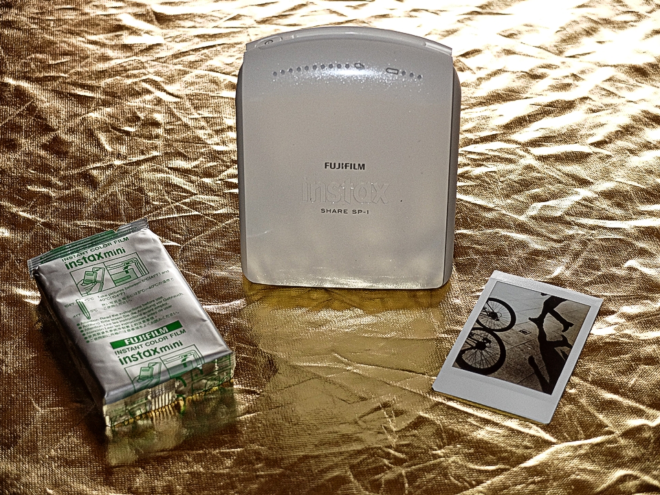
This article is intended for persons who are interested in printing externally processed images on Instax Mini film via the Instax printer. The Instax Mini film is an 800 ISO, 5,500 degree Kelvin daylight colour temperature, Silver-halide based, 3-colour (CYM) dye, instant film, of the integral type. (There is no accessible negative). The Instax Share SP-1 is a 3-colour (RGB) LED exposure printer with liquid-crystal shutter. It is able to print in 256 levels for each of the RGB colours (giving the theoretical 16.777 million colours). In simplified terms, the printer works pretty much like a flat-bed scanner in reverse; – instead of producing data from an image, it produces an image from data.
Aim of the test
My intention was to determine if the combination of Instax SP-1 printer and the Instax Mini film could reproduce the patches on a colour target to a very high standard. I was not expecting the combination to give a perfect reproduction “out of the box” (that is, without any adjustment processing). But I wanted to see if by making judicious adjustments, the output could be tweaked to give a good / very good reproduction of the target colours. I tried to control the capture and initial processing parameters as much as possible, but the final tweaking and assessment relied on visual methods. I was looking for good results in both hue and saturation.
1 Capture
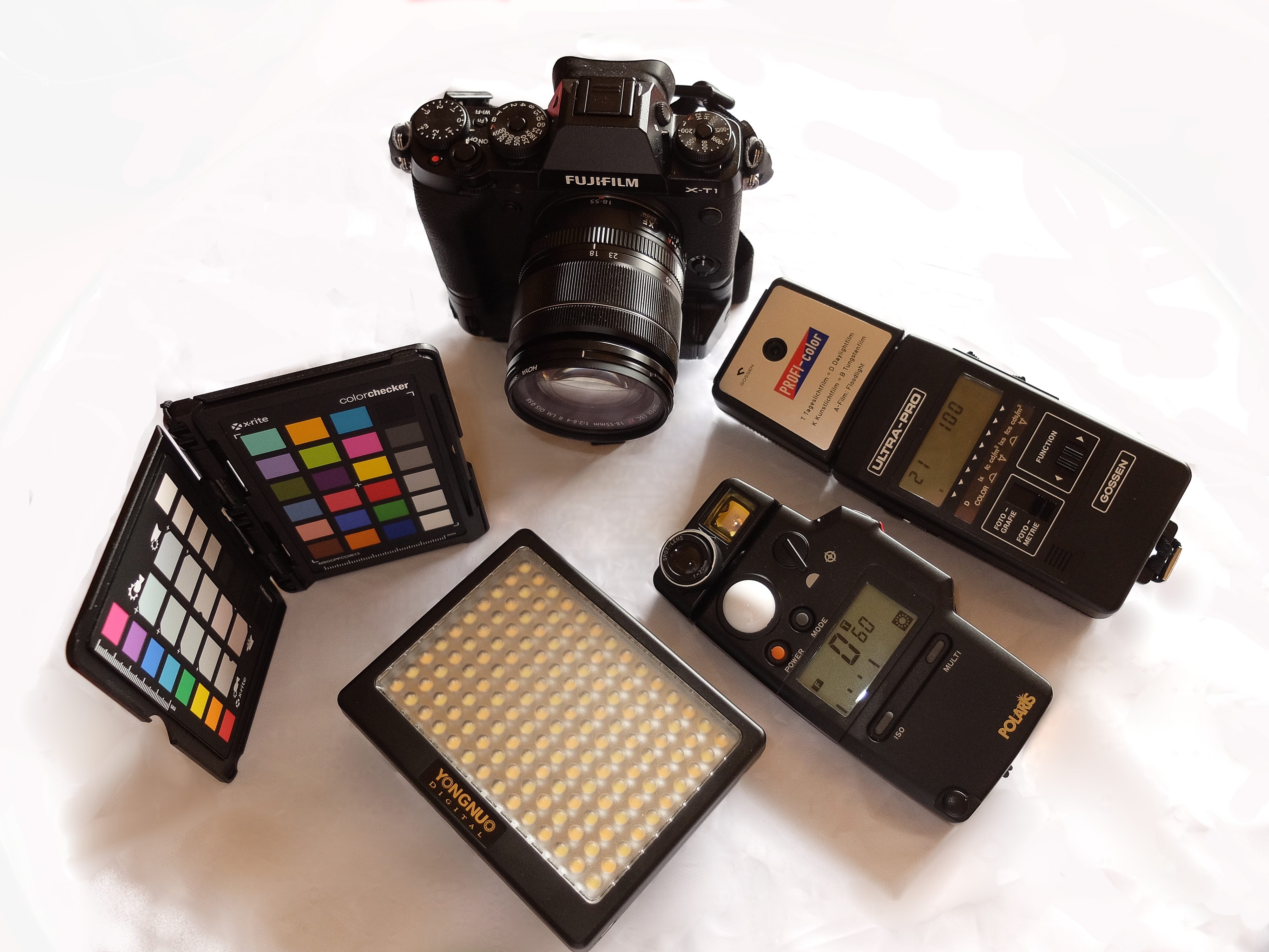
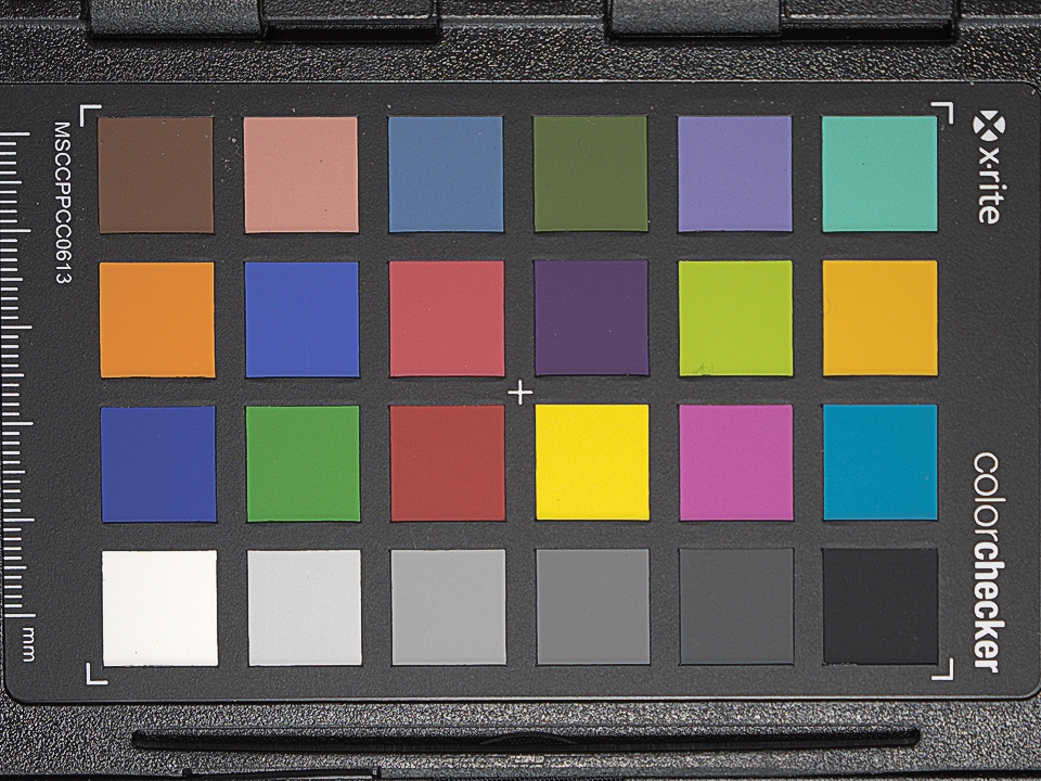
The test target was an X-rite Colorchecker Passport. Illumination was by a YongNuo YN140 LED panel, with colour temperature calibrated to 5,500 degrees Kelvin. (I used this LED panel because, as a constant light source, it was easier to calibrate to the film’s colour temperature). Colour temperature calibration was done with a Gossen Ultra-Pro, with Profi-color attachment. For metering, I used a Polaris Dual 5, set to incident metering mode, to get standard exposure settings. The camera was a Fujifilm X-T1, shooting Raw files, at base ISO. Exposure settings were ISO 200, 1/60 sec, F4.
2 Initial processing
I brought the RAF (Fuji raw) file into Raw Therapee 4.2.1, for raw development. All adjustments were set to neutral, except the colour management input profile, where I used a generic profile for the X-T1. I then set the white balance to 5,500 K. Finally, the image was cropped and sharpened, and then saved as a pro-color, 350 dpi, 16bit Tif file. This became my working master file, which I could return to, if I had to produce new Jpg files to work or experiment on.
3 Preparation for printing
I then brought the Tif file into Perfect Photo Suite 9, and converted to a sRGB, 254 dpi, Jpg, at the appropriate size for Instax printing. (I could have done this in Raw Therapee, but I have a Instax preset in PP9, so it was easier, and this is my standard workflow for Instax printing). (For more detailed information, see The Fuji Instax SP-1 printer: Tips for Pros).
4 Preliminary printing
I transferred the Jpg file to my tablet, and used the SHARE app to send the image to the SP-1 printer. (Currently, the SHARE app is the only way to send an image to the SP-1, hence the transfer to tablet). I had warmed the room’s ambient temperature up to 25 degrees Celcius, to achieve an optimum development environment (as per Data Sheet). It requires at least 10 minutes for the developing process to finish. After printing, I waited 15 minutes before proceeding to the next step.
5 Preliminary assessment
Under natural lighting, I held the Instax print and the actual Colorchecker next to each other, and patch by patch, made a comparison. I was mainly interested in the two sets of primary colours (the Blue, Green and Red, and the Yellow, Magenta and Cyan). The primary Red seemed subdued and slightly dirty, as if not a pure red, (and as a consequence the orange and the brown were a bit lacking in warmth). The second thing I noticed was the Magenta; the hue was good, but it looked to be on the light side – slightly undersaturated. The third thing was that the primary Yellow looked more like a Lemon Yellow, so the hue needed a tiny bit of warmth. These were the deficiencies that I intended to concentrate on for my adjustments in the next step.
6 Fine-tuning processing
I brought the Jpg file into PhotoShop CS6 13.0.1, and applied hue and saturation adjustment layers to several of the primary colours, while doing a visual comparison between the colorchecker, the Instax print, and the Jpg on my calibrated monitor. (I was using the recommended standard soft-proofing conditions). I then flattened the layers, and saved the new version of the Jpg, with an appropriate filename change, for identification purposes. (If I had to do this more than once, I would go back to the Tif master file, and make a new jpg, to avoid making copies of copies of jpg images, with the subsequent quality losses involved; but typically I don’t find problems with a first generation copy, made at highest quality setting).
7 Final printing
The procedure was the same as for the preliminary print. However, since there were more than one similar-looking prints now, it become important to label them, to be sure which was which.
8 Final assessment
Once again, under natural light, I compared the Colorchecker with the refined Instax print. This time I was happy with the correspondence. If I hadn’t been, then it would be a matter of returning to step 6, and making further adjustments, until a satisfactory result was achieved. (Actually, I didn’t consider the result to be perfect, but for the purpose of showing what we’re looking for, and what we don’t want to find, in step 11, it suited me to proceed with a less than perfect image).

9 Preparation for presentation
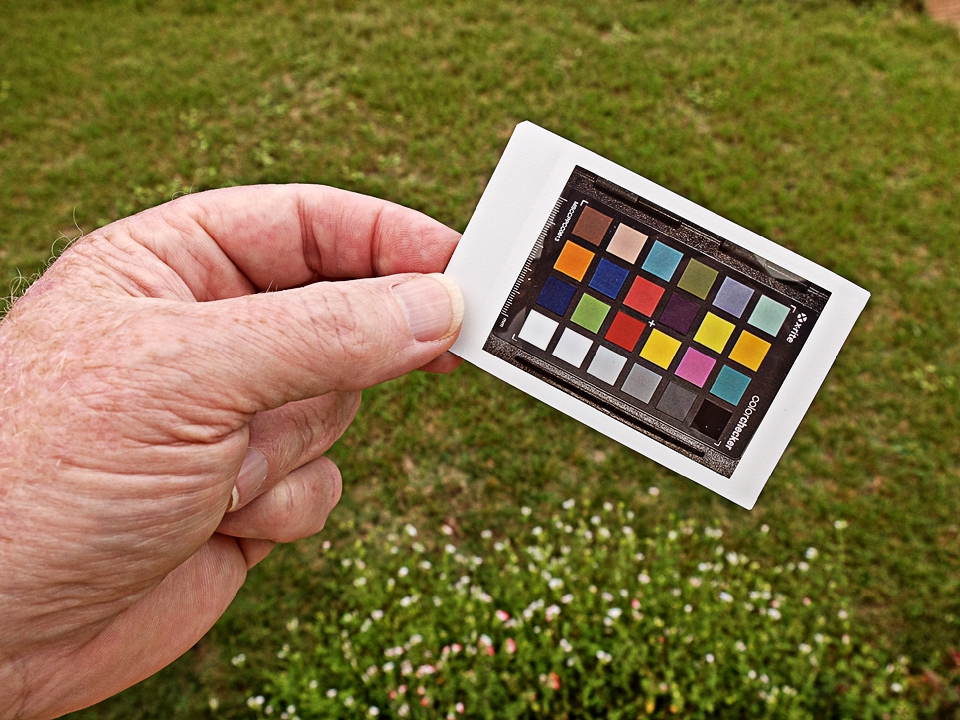
I wanted to prepare my results, so that comparisons between the Colorchecker and the print, could be made with the ultimate ease. This meant using scissors to carefully cut out each individual colour square from the print. I’ve cut up Instax Mini prints before, so I knew what to expect. When cutting, some black developing chemical might exude from the cut edge. It’s likely to be in the form of a paste, rather than a liquid. Today, I didn’t have any problem with it. When all of the colour squares had been prepared, I carefully laid each one in the corner of its corresponding colour patch on the Colorchecker.
10 Photographing a comparison image
The final stage was to photograph the Colorchecker with the overlaid Instax patches. Again, I used the YongNuo LED panel for lighting.
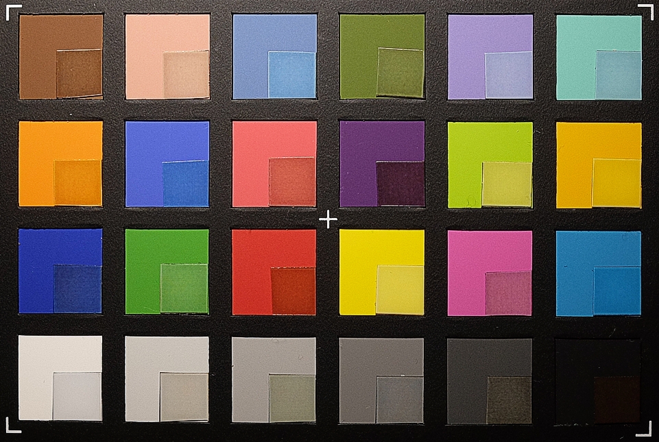
11 Assessment of the comparison image
The Instax print looked quite good when just held beside the Colorchecker. But now that the little Instax patches are laid over the Colorchecker, it is much easier to see points of difference. (As I mentioned earlier, I chose to use a less than perfect image – because it is a better learning / demonstration tool). I think most people should be able, intuitively, to suggest what needs to be done with each of these colour squares. The best result is where the little patch almost can’t be distinguished from the larger patch. For many of the patches, the hue matches, but there is a difference in brightness. However, several of the patches still need a hue adjustment. I’m actually quite happy with this initial run. With some more time and work, I think I could get all of these matching very closely.
12 Where do we go from here?
In the normal workflow, when preparing to print an image, we open a print dialog, and one of the selections is colour management, where we are given the option to let the printer manage colours, or alternatively, we can select the option to let the application (the software you are using to request the printing operation) manage colours, in which case you will specify a printer profile. The printer profile will indicate a particular printer model, printing to a particular paper or media type. It could be a generic profile, supplied by the manufacturer, or if you have printer profiling capabilities, it could be a user generated profile, made for your unique printer. Anyway, currently, the only way to initiate an Instax SP-1 print, is via the SHARE app, and that app does not allow us to specify profiles. I presume there is a software or firmware profile within the printer unit. What if you want to apply a profile? I think that the best method might be to set up a preset / action / macro (say, based on the adjustments that were done in step 6), and save that, to be used as part of your workflow for any images that are to be Instax printed. However, an alternative approach would be to get to know your system better, by making some test prints (under controlled conditions). Then you can say, for example, “I know that with my system (which includes the camera, software, monitor and workflow) this colour tends to come out a little undersaturated, and that colour needs to have a little more warmth added to its hue”. This method is more art than science, but I believe this could help optimise the colour rendering from your Instax printer.
Conclusions
After this experiment, I am satisfied that the Instax Mini instant film, printed from the Instax SP-1 printer, is able to achieve a high standard of colour capability. Because Instax printing costs money and depletes resources (you only have a limited number of films), proofing by printing could be expensive. The goal should be to implement a system where you can confidently soft-proof images intended for Instax printing (that is, you can accurately preview the colour rendering on your computer monitor). You need to be aware of, be able to control, and take account of capture and processing parameters. You also need to have an intimate knowledge of how Instax film behaves, and any of its peculiarities. I highly recommend that you work with a calibrated monitor. Based on my experience of working with Instax film, I am confident that it is possible to achieve excellent colour rendering, although this may initially require some experimentation, and specific workflow adaptations. Please enjoy the unique qualities of Instax Mini film.
