Adobe plus Seven Yellow
This information is intended for persons who wish to optimise colour rendering when sending an image direct from a Fuji X-series camera to an Instax Share printer.

For any images where colour accuracy is paramount, it is possible to produce improved colour rendering fidelity from the Instax Share printers, by making some simple in-camera adjustments.

My tests indicate that improved colour results are generally delivered by using AdobeRGB COLOUR SPACE along with a 7 yellow WHITE BALANCE SHIFT, which will bring the rendered colours more closely in line with the target colours, as well as giving very neutral grey-tones.

The method works with both the SP-1 and the SP-2 printers.

(Please note: Your viewing of colour test images in this article may be sub-optimal if you are using a monitor that is not calibrated, or if you are viewing in a browser that does not implement colour management. Firefox is colour managed for images tagged with ICC color profiles.)
The WB SHIFT requires setting the reference point on the Blue-Yellow axis to B -7 (that is, biased 7 increments below the neutral position, away from Blue and towards Yellow). WB SHIFT can be set from either the Shooting menu (in which case the Shift becomes the default for whatever White Balance was set at the time – not recommended), or from the in-camera Conversion menu (in which case, the Shift will only apply to the image being processed – recommended).

When you apply these settings, the image as viewed on the camera’s LCD screen may appear with a yellow cast. However this cast will be absent from the Instax printed image. (I don’t recommend shooting “Jpeg only” with the 7 yellow WB Shift as a default, because it may make the image unsuitable for anything other than Instax printing, due to a yellow cast.)

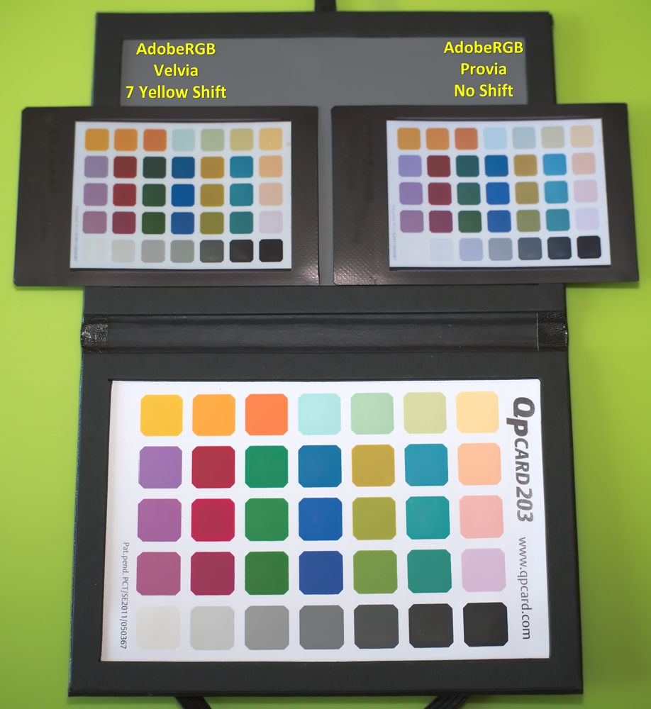
To further promote vibrant colour rendering, I usually set the Film Simulation to Velvia. For the purpose of testing, I printed the control film using the Provia Film Simulation, which is considered to be the most neutral.
In the above image, I printed the Instax films slightly darker, so that the very light patches could also be assessed. Later when digitally sampling them with the pipette tool, I can increase their lightness, to normalise them with the target chart.
The Adobe-plus-Seven-Yellow settings should deliver a high degree of colour fidelity in the printed Instax image. You may not get perfection, but you can expect substantial improvement. Let’s start with our control results (no yellow shift):
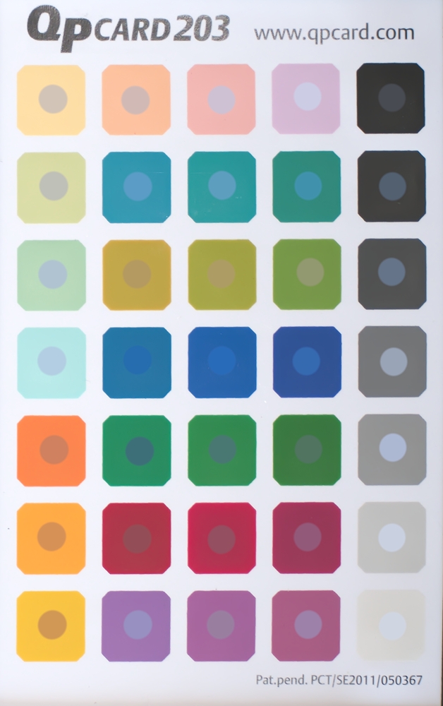
The above image shows the results for AdobeRGb, Provia, No WB Shift. On each patch, the central spot is a pipette sample of the corresponding patch on the Instax print. The most frequent result is that the central spot is “too blue”, indicating that there is a difference in the hue or tint. Note that all of the grey-scale spots have a blue tint to them.
Now, we have the results for the adjusted image:
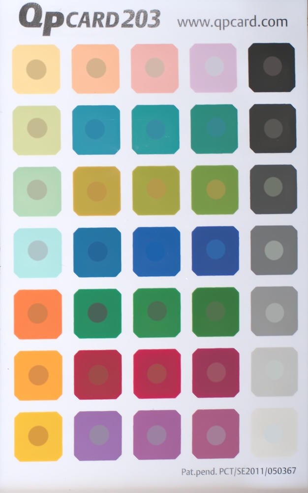
The above image shows the results for AdobeRGb, Velvia, 7 Yellow WB Shift. On each patch, the central spot is a pipette sample of the corresponding patch on the Instax print. The most frequent result is that the central spot is “darker” or “lighter”, but in general the spot is close to the target hue or tint. Note that the grey-scale spots are very neutral, as they should be.
The display method that I have used (sample spot superimposed over target patch) highlights minute discrepancies between the target and the Instax printed reproduction in a very unforgiving manner. Alternatively, the following side-by-side comparison shows the differences less harshly.


Considering that direct transmission from camera to printer does not allow the opportunity to use either a camera profile or a printer profile (as would normally be required for colour management), I consider that the Adobe-plus-Seven-Yellow is a worthwile method. You can expect better rendering of pastel shades, better skin-tones, better grey-tones, and an overall better “feel” of having captured the colours as you remember them at time the photo was taken. Expect also the base white of the Instax medium to not show a false coolness or “blue”-whiteness.

The settings described in this article, which were established using an X-T2 camera, a QpCard 203 colour target, and an SP-2 printer, have also been tested with the X-T1 and the SP-1. Although there might be small differences between individual cameras and printers, the 7 yellow WB Shift might be considered a good starting point for any experiments of your own.
If you are going to prepare images on a computer, rather than in-camera, then you don’t need to worry about AdobeRGB and WB Shift. Instead, you can use the dedicated SP2 printer profile, which is available in section G3 of my earlier article: Optimize Images for Instax SP-2 Printing.
Instax Colour Tweak
All images on this page © 2017 Dom Varney
 Images on this page are licensed under a
Creative Commons Attribution-NonCommercial-NoDerivatives 4.0 International License.
