Optimize Images for Instax SP-2 Printing
The Definitive Reference Guide to image preparation for Fujifilm Share printing
This information is intended for people who wish to gain extra control over their Share SP-2 Instax prints, by pre-processing their image files on computer before sending them to the Share printer. If you are using the SP-2 printer for some specialist purposes, or you want to attain the ultimate Instax print quality, or perhaps you just want to know more and more about the world of Instax film, here you will find information suitable for users from beginner right through to expert level.

Contents
Section A – INTRODUCTION
A . 1 The Instax Share Printer
A . 2 Specifications
Section B – FROM CAMERA TO PRINTER
B . 1 Pathways
Section C – OPTIMIZATION TASKS
C . 1 Preliminary
C . 2 Overview
Section D – ASPECT RATIO & CROPPING
D . 1 Aspect Ratio
D . 2 Cropping
D . 3 Tab Position
Section E – SIZE & RESOLUTION
E . 1 Resizing
E . 2 The Instax Viewing Frame
E . 3 Loss of Extreme Edges of Image
E . 4 Edge Loss Compensation
E . 5 Summary of Options
Section F – PHOTOMETRIC ADJUSTMENTS
F . 1 Input Levels
F . 2 Output Levels
Section G – WORKING IN COLOUR
G . 1 Gamut
G . 2 AdobeRGB and sRGB Colour Spaces
G . 3 SP-2 Specific Printer Profile
G . 4 Rendering Intents
G . 5 Soft Proofing and Gamut Warnings
G . 6 Black Point Compensation (BPC)
G . 7 Convert (Not Assign)
G . 8 Summary of Options
Section H – WORKING IN MONOCHROME
H . 1 Choice of Film Type
H . 2 Converting to Black & White
Section I – ACUTANCE
I . 1 Sharpening
Section J – OUTPUT FORMAT
J . 1 Save Format
J . 2 Save As …
Section K – PRINTING
K . 1 Image File Transfer
K . 2 The Share App
Section L – POSTSCRIPT
Part 1, consists of an exploration of key concepts and requirements. You can skip any sections that you are already very familiar with, or sections that you don’t consider significant for your style of photography, or sections that you don’t really understand at the moment. Part 2, will augment this information by way of a step-through of workflow in both Photoshop (the industry standard, commercial image editing package) and Krita (a freely downloadable, open source image editing package).
Section A – Introduction
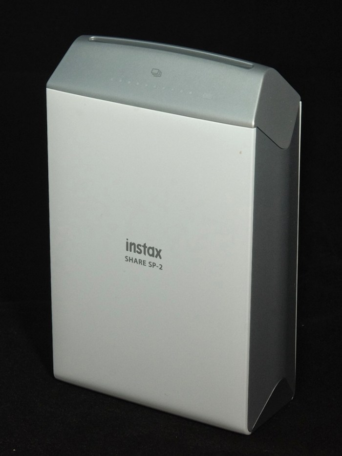
A . 1 The Instax Share Printer
The Fujifilm Share printer, which is part of the Instax family of products, is marketed as a smartphone printer. It uses the same Instax Mini film as the Instax Mini cameras. During 2016, the Share printer, and the Share App which services it, were both upgraded significantly from the original SP-1 printer. Changes which do not affect the print quality included:
- adoption of a rechargeable battery
- USB charging
- decreased printing times
The main enhancements affecting image output were:
- increased functionality to the SHARE App
- increased resolution to the SHARE printer
- exposure using OLED (organic light emitting diodes) technology
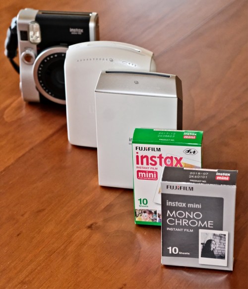
Support for the Instax printer and cameras was further enhanced by the release of another film type, so that users can now choose between the original Instax Mini colour film as well as the new Instax Mini Monochrome film.

A . 2 Specifications
The important image related specifications are as follows (along with the specifications of the SP-1, for comparison).
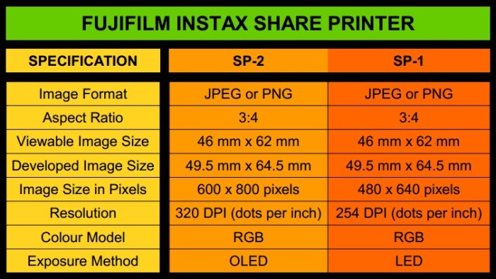
The following information is directed mainly towards use of the current SP-2 printer model, with mention of critical differences in the SP-1 model, where they exist.
Section B – From Camera to Printer
B . 1 Pathways
There are two types of device capable of sending a print order to the SHARE printer:
- A Fujifilm X-series camera
- A mobile device (phone or tablet) running the Fujifilm SHARE App
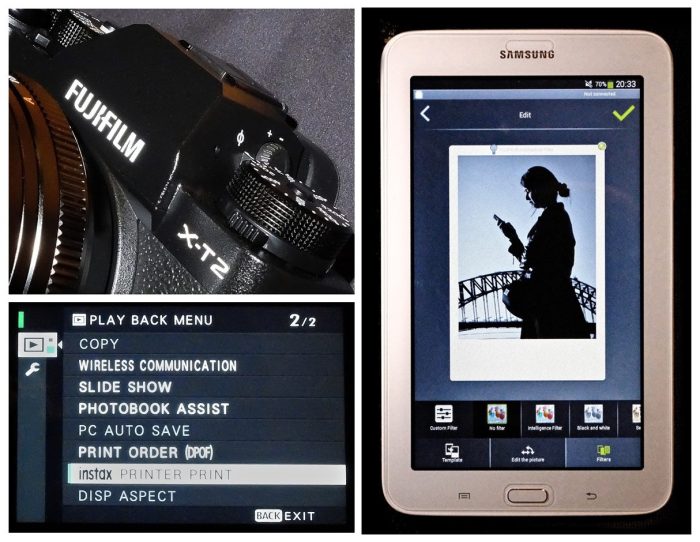
If you pre-process images on the computer, you still have to transfer them to a mobile device running the Share App, in order to print them. This leaves us with 3 basic pathways for printing via the SHARE printer.
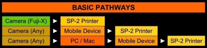
The third path, using a Mac or PC as an additional step between the camera and mobile device, although longer, gives the greatest degree of control over the resulting print. An intermediate level of control may be available by using image processing apps, such as Snapseed for instance, on your mobile device. However, the following explanations will concentrate mainly on the computer (desktop or laptop) preparation of your images.
Section C – Optimization Tasks
C . 1 Preliminary
The only absolute requirement for images intended for Instax Share printing, is that they be sent to the Share App in a file format readable by the App – either jpg or png.
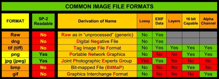
Png files can be in either 8 bit or 16 bit colour depth, although they will only be printed with 8 bit precision. If the image is not in jpg or png format, then you will have to convert it, when saving for output.
C . 2 Overview
Image pre-processing on computer consists of seven main tasks:
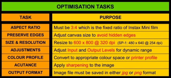
Note that, depending on your software package, such tasks as cropping for aspect ratio, and resizing, may not be treated as separate operations. With the exception of preserve edges, the basic tasks listed here, are the same as those performed when preparing an image for any other printer. Not all of these tasks have to be performed on every image. Part of the expert knowledge is to know when something is required, and when it is not.
Section D – Aspect Ratio & Cropping
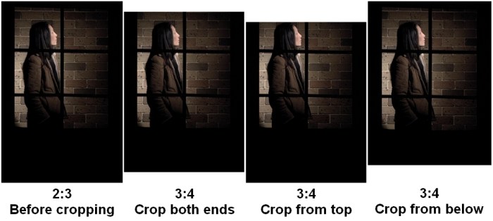
Aspect ratio and cropping are about ensuring that the image is the correct shape for Instax printing, as well as determining what parts of the image are retained and which parts are removed in the re-shaping process.
D . 1 Aspect Ratio
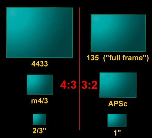
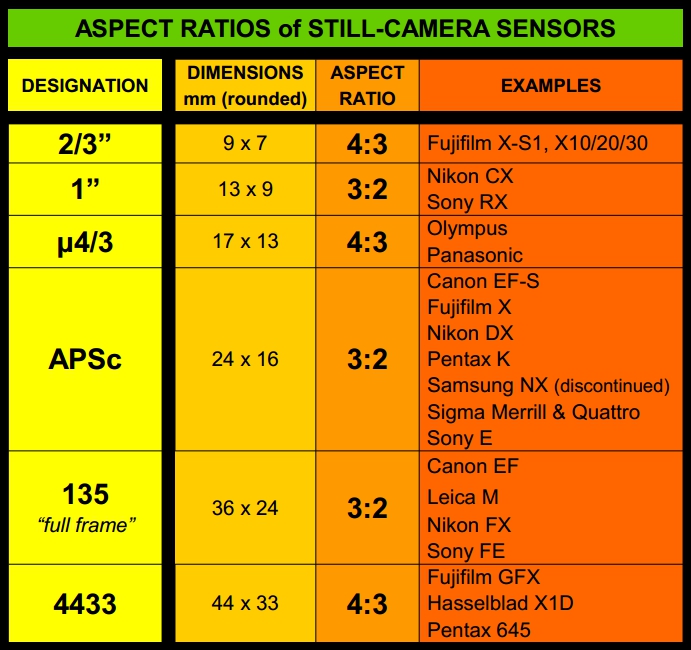
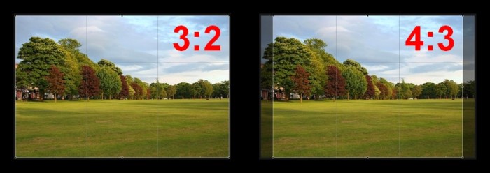
Aspect ratio compares the long dimension of a rectangle to its short dimension, and specifies a shape rather than a size. Typical still-photography aspect ratios are 1:1 (mainly in medium format), 4:3, and 3:2.

For Instax printing, the aspect ration of the image must be to a 3:4 ratio (or, 4:3 in horizontal format). Depending on the sensor format of your camera, aspect ratio conversion may be necessary.
D . 2 Cropping
There are two main reasons for cropping. One reason is that you only want a small part of a much larger image. Because the final prepared image only has to be 600 x 800 pixels for Instax printing, there is typically plenty of scope for cropping down to a small section of a large image, without loss of resolution. The other reason for cropping is to make an aspect ratio conversion. Such a conversion typically entails loss of some part of the image.


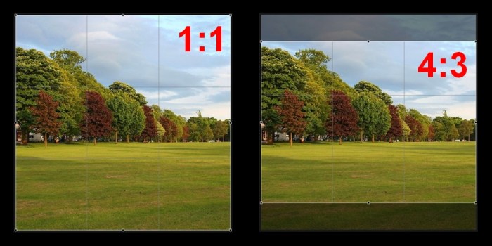
When working with the full image, and the cropping is only required for aspect ratio conversion, you can vary the allocation of amounts cropped between the two opposite sides, even doing all of the crop from just one side. In such cases, it is important to consider the effects upon composition of different cropping options.
D . 3 Tab Position
The white frame of the Instax Mini film has a broad tab, which covers the developing chemicals pod. The tab is convenient for holding and for labeling the print. The normal position of the tab is at the bottom for vertical orientation images, and at the right hand side for horizontal orientation images. If you want the tab to be on the left hand side or on the top, you need to do a 180 degree rotation (or two 90 degree rotations), so that the image appears up-side-down on your computer monitor, or mobile device screen.

Section E – Size & Resolution
Instax Mini film has fixed format dimensions, with a set viewing frame. So it is always a case of fitting the image to the film, not the film to the image. The following explores some features that are unique to Instax film, and which should be understood in order to avoid running into unexpected image fit problems.
E . 1 Resizing
The image sent to the SP-2 printer must be 600 x 800 pixels @ 320 dpi (or, 480 x 640 @ 254 dpi, for the SP-1 printer). Again, the Share App will do this automatically, if the image is not the correct size and resolution, but you can do this yourself. The main advantages of doing the resizing yourself are:
- Ability to select the resizing algorithm (for example, Lanzcos, bilinear, bicubic, etc)
- Ability to create a canvas and set edge margins to the image
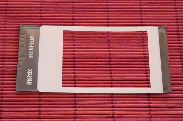
E . 2 The Instax Viewing Frame
In order to properly understand the following information, it is important to keep in mind that viewing and exposure happen on opposite sides of the Instax Mini film. The “reverse” (non-picture) side of the film is actually the side on which exposure takes place. The exposure surface is brown prior to developing. Exposure is not limited to the area within the white viewing frame at the front of the film (or black frame, if using the new Instax Mini BLACK film), because exposure is done through the back.

The white viewing frame, which defines the viewable image size, has the dual purpose of not only providing an aesthetic frame for the image, but also wraps around the various components of the Instax film, such as the cover sheets, the developer burst-pod and the chemical excess absorbing strip, to hold them together and in place.
Below are two images of an Instax print, first without and then with, its viewing frame. You can see various artifacts which are the result of the spreading of the developing fluid, and how the viewing frame gives the photograph a neat and finished appearance.
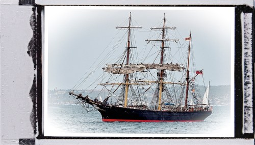
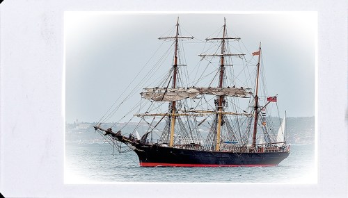
However, due to this viewing frame, which covers somewhere between 0.5 to 1.3 millimetres of the image on each of its four edges, the view-able image is only approximately 94% of the exposed and developed image. Due to the small size of the Instax film, a millimetre may represent a significant amount. The viewing frame covers process spillage and alignment discrepancies, but at the cost of losing visibility of the extreme edges of the image.
E . 3 Loss of Extreme Edges of Image
Whether or not this is of any consequence, depends on your photographic intention and purpose. For most casual photography, you could simply ignore this extreme edge loss as insignificant. However, for more critical applications, or for specific images, you may wish to apply some compensation towards this edge-loss. For example, if you are going to print an image where the framing is quite tight, then edge loss could lead to loss of critical detail, or could spoil the composition. In such a case, edge loss compensation may be in order.


E . 4 Edge Loss Compensation
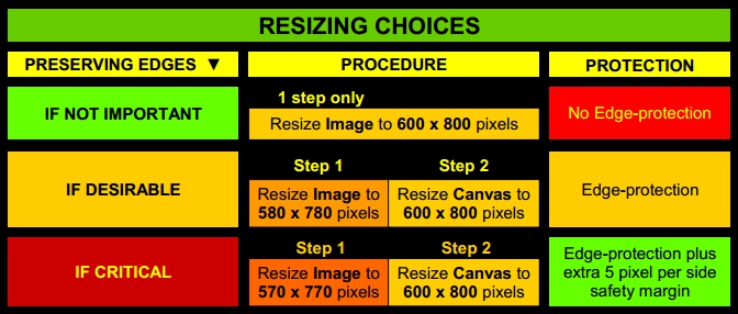
In order to preserve the extreme edges, we can apply an edge loss compensation. It is common for advanced image processing software to differentiate between image dimensions and digital canvas dimensions, and edge loss compensation makes use of the canvas resizing function.
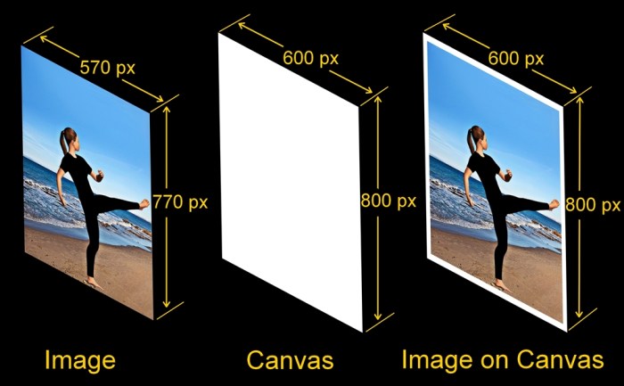
This allows you to send the specified 600 x 800 pixel print request to the SP-2, where the 600 x 800 is the size of the Canvas, while you can set the actual image size to 570 x 770 pixels (or 580 x 780 pixels), which will not reach right to the edge of the Canvas. As a consequence, none of the intended image is obscured. Image sizing dimensions are derived from the following table, which is a compilation of both published and measured data.

To protect or preserve the extreme edges, theoretically, the image only has to be reduced to the viewing zone size. However, because of the possibility of film and exposure mis-alignments (both off-set and rotational), I have found it safer to allow a further 5 pixel per side image size reduction, if you need to ensure that no edges of the image are being covered. This extra 5 pixel margin may be visible as a tiny gap between the image edge and he inside edge of the viewing frame, where the canvas can be seen. Note that it is also possible to set the colour of the canvas, which may be useful in hiding this gap.
E . 5 Summary of Options
Section F – Photometric Adjustments
These adjustments are concerned with light, darkness, tonality and dynamic range in the image. Ultimately, we have to fit the dynamic range of the scene photographed to the tonal capabilities of the Instax Mini film.
F . 1 Input Levels
Adjusting the Input Levels in an image will not only affect the brightness and tonality, but it also ensures that the Instax Mini film’s ability to express light and dark is fully utilised.

The original image, on the left, was taken on a misty day, and so lacks contrast and seems to lack detail, both in the sea and in the clouds. Although it is an accurate visual record, it may look quite “flat” when printed. By adjusting its Input Levels, we can ensure that it makes use of the full range of tones between black and white on the Instax film, as well using contrast to bring out the detail in the shot.
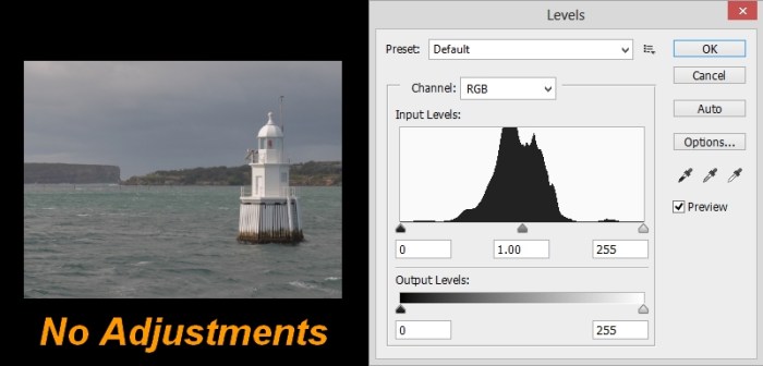
We use the image’s histogram as a guide to making the adjustments.

To set the “Edge of Black”, slide the Black level marker until it reaches the first significant part of the left-side of the histogram, ignoring the flat (insignificant) data to the left of the histogram. (There will be an insignificant loss of detail in the shadows).
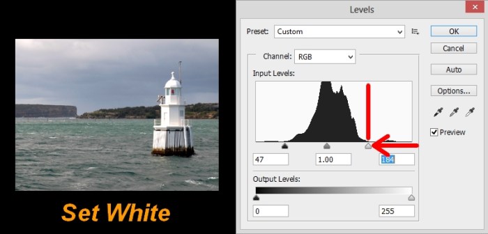
To set the “Edge of White”, slide the White level marker until it reaches the first significant part on the right-side of the histogram, ignoring the very flat (insignificant) data on the right of the histogram. (There will be an insignificant loss of detail in the highlights).

To set the Mid-tones, initially slide the Mid-tone marker to a position that divides the main section of the histogram into two sections of approximately equal mass (halve the mass, not the distance). You can then make further Mid-tone adjustment according to intention: – high key, low key, etc. Ultimately, you should use your own visual assessment as a guide.
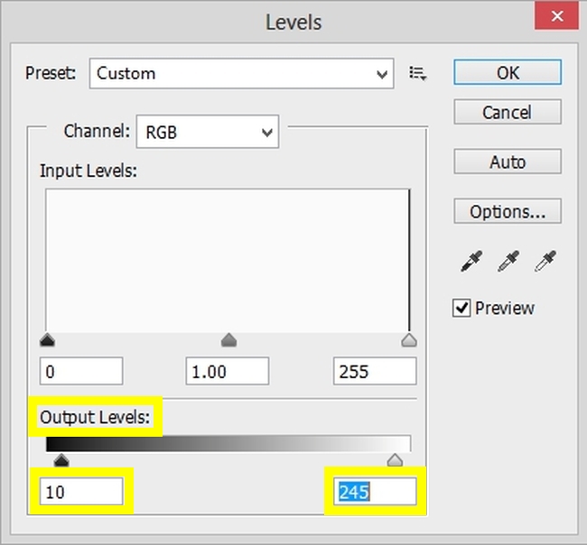
F . 2 Output Levels
As with all print media, an ideal pure white and an ideal pure black is not realistically achievable. What can exist in theory, is not always reproducible in the real-world.

Setting the output levels can make an allowance for this discrepancy between theoretical output and actual printer performance.
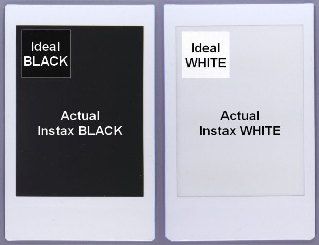
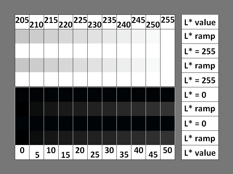
If you wish, you can adjust the output levels (situated below the input levels) in order to match the Instax Mini film’s lightest and darkest tone capabilities. In this way, you will avoid asking the printer to print blacks and whites that are outside of its reproduction capabilities. For colour film, set black output level = 15 and white output level = 245, and for monochrome film, set black output level = 10 and white output level = 250 (revised measurements, Mar 2017).
These levels are derived by Instax printing the following test chart, and determining from the print, the points at which highlight and shadow tonal discrimination is no longer possible. (These will, of course, differ from what is observed on an LCD screen.)
Section G – Working in Colour
Our main concern here, is to select an appropriate colour space or printer profile for the Instax print. Selecting a colour space or a printer profile, is part of a much larger system called colour management. Here I will only be looking at the issues directly touching the Instax printer, so input profiles, and monitor profiles, for instance, will not be addressed.
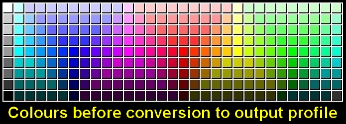
G . 1 Gamut
The full range of colours that can theoretically exist can be plotted on the CIE (Commission Internationale de l´Eclairage) Chromaticity Diagram. A Colour Space is the constrained region that can be accurately rendered by a device, such as a monitor, or a printer. Colour spaces are actually three dimensional, with another perpendicular axis representing levels of lightness and darkness for each hue. The complete range of colours contained within that colour space is its Gamut. The Instax Share printers will have their own (relatively restricted) gamut, and some colours recorded by the digital camera, will lie outside of this gamut, which is why colour space and colour conversion become issues.
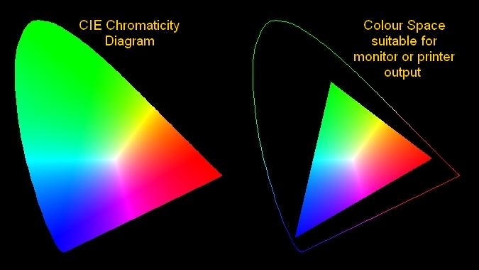
There are many colour spaces available within which images files can be saved. However, to simplify the situation, just three generic colour spaces will be sufficient to address most photographic needs. The three most commonly used colour spaces in photographic work are:
- ProPhoto (for the preservation of original, unedited image data)
- AdobeRGB (for highest quality output situations)
- sRGB (for most other purposes)
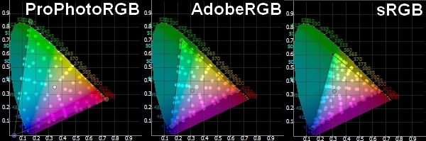
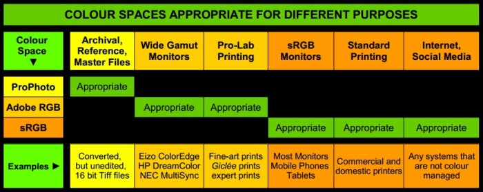
Note that the ProPhotoRGB colour space cannot be fully rendered by any output device (monitor or printer). The following chart gives an overview of Colour Space and intended purpose.
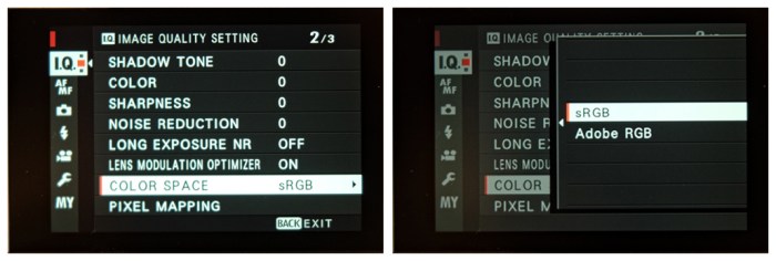
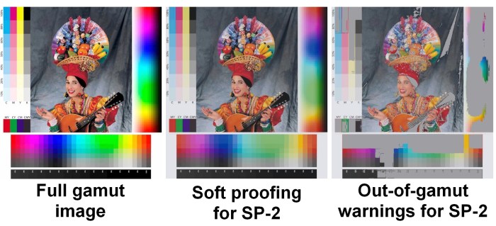
G . 2 AdobeRGB and sRGB Colour Spaces
The main reason we are interested in AdobeRGB and sRGB colour spaces is because many DSLR and Mirrorless cameras allow you to specify which of these colour spaces to use when saving jpg files. That means that when images are sent to the Instax printer, this choice of camera setting will affect how the images are rendered.
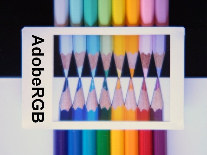
Below is a test image, accompanied by two Instax prints, one saved in the AdobeRGB colour space, and the other saved in the sRGB colour space.

The above image is NOT covered by this site’s Creative Commons BY-NC-ND 4.0 License.
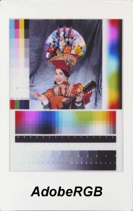

When you look at the colour spectra to the right and below in each image, clipping in the green and cyan is immediately obvious in the print saved in the AdobeRGB colour space, while heavy saturation of the green and cyan is apparent in the print saved in the sRGB colour space. Bear in mind, that test images are designed to exaggerate colour anomalies. However if you just take a casual glance at the central picture, the two images look very similar, so there is no need to become paranoid that a “wrong” colour space choice will ruin your image. The different tendencies can be summarised in the following table:

Giclée fine-art inkjet printing can require up to a dozen different inks, to render images in the Adobe RGB colour space. So we would expect that a simple 3 dye process like Instax film should, in principle, be constrained to a much smaller colour space like sRGB. However, given the tendency of greens and cyans to saturate when the sRGB colour space is rendered by the SP-2, there are situations where the larger AdobeRGB colour space might work better, because it would induce some (intentional, in our case) clipping of the greens and cyans.
G . 3 SP-2 Specific Printer Profile
If you are able to pre-process images on computer, a better approach is to use a device-dependent output profile. Unlike generic colour spaces, which are not specific to a particular output device, a printer profile contains colour information that is conformed to the printer’s own colour space, and which is adapted so that the colours display with the appropriate hues and luminosities. Because of Fujifilm’s main intended market for the Share printer, the company probably doesn’t (at this time) perceive a need to make available a printer profile for the SP-2, so it’s mainly up to enthusiastic users (including those who use Instax film for some professional purposes) to come up with an SP-2 icc profile. An icc profile is a set of data that characterizes a color input or output device, or a color space, according to standards promulgated by the International Color Consortium (ICC).
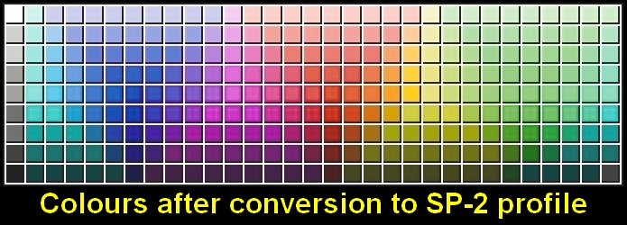
There are numerous difficulties with producing an icc profile for the SP-2, mainly due to the restricted Instax Mini print size, which is too small for typical profiling setups. However, I was able to produce an interim profile, which you can download as a compressed file: SP2 Instax Color Ver 1-00.icc Please keep in mind that this is an imperfect, experimental profile. Also, it was not produced by the Fujifilm Corporation, so criticism of the profile’s deficiencies should not be dircected at Fujifilm.
In the following photographs, the Instax prints (which have been prepared by converting the raw file to jpg files in the AdobeRGB colour space, the sRGB colour space, and the SP-2 printer profile), are placed upon the real pencil targets, for comparison of luminosity and hue accuracy. Because I wanted to examine colour accuracy, I used the absolute colorimetric rendering intent (explained further down).
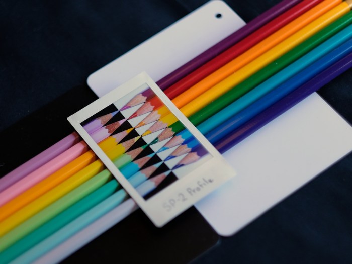
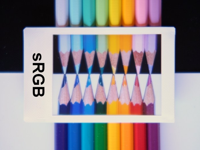
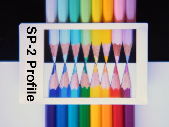
Although the SP-2 printer profile has its deficiencies, it is the outright best in terms of hue accuracy. Please note especially the cyan coloured pencil (top, third from the left) in each of the photographs; – it is on of the most difficult of the colours to reproduce. Based on my own extensive testing, the main features of the (interim) SP-2 printer profile are:
- Greens and cyans are more well behaved (they don’t tend over-saturate, or to become too dark)
- Skin-tones look more natural
- Grey-tones are less cool
- “White” is a better match for the Instax film’s media white
In order for the profile to be accessible to your image processing software, after unpacking the zip file, you just need to put this icc file into your colour profiles folder. On a Mac, icc files are installed by dragging them to: /Library/ColorSync/Profiles/ You may have to unlock this folder. On a PC, place the file in: C:\Windows\System32\spool\drivers\color Krita maintains its own colour profiles folder, which on a Windows system, is in: C:\Program Files\Krita (x64)\ share\ color\ icc \ krita
G . 4 Rendering Intents
To avoid the problem of trying to print out-of-gamut colours, we convert the colour space of the image to a range of colours which the SP-2 can print properly. Our conversion strategy is called the Rendering Intent, and it determines how out-of-gamut colours will be dealt with. The conversion process re-maps any “out of gamut” colours to other colours within the printer’s own gamut. There are four Rendering Intents, which will be found in the colour conversion dialog of image editing software.

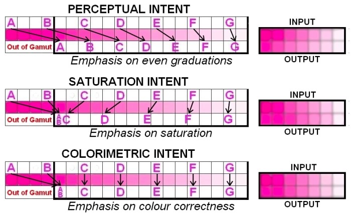
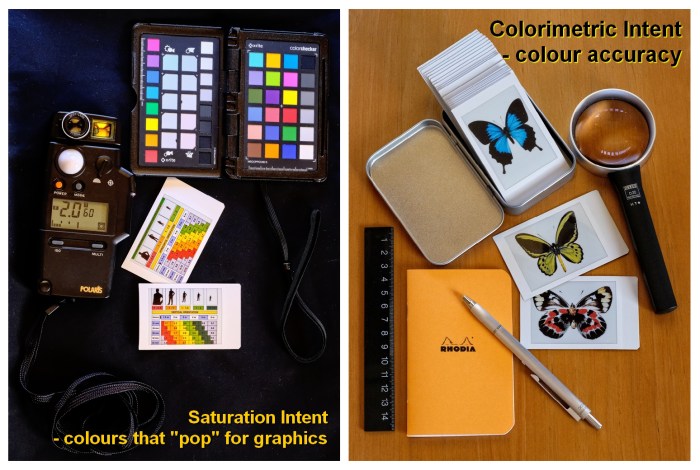
Photographers generally use perceptual intent, since its rendering is aesthetically pleasing, producing the best graduations, and being less prone to banding than the other intents. However you may find that for special applications, other intents may be more suitable.
The decision on which one to choose can be helped by the process of soft proofing.
G . 5 Soft Proofing and Gamut Warnings
Soft proofing and out-of-gamut warnings are useful in determining which rendering intent to use for a particular image. Soft proofing attempts to show what an image will look like when converted to the printer profile, without having to actually print the image (hard proofing). Out-of-gamut warnings show which colours will have to be changed due to being outside of the printer’s gamut. If all colours are within the printer’s gamut , then you can use a Colorimetric intent, which will reproduce the colours with more accuracy. However, if the out-of-gamut warning identifies a significant number of colour areas that are outside the printer’s gamut profile, then the Perceptual intent may be a better option, since it will be less prone to banding. Note that soft proofing and gamut warnings are for pre-conversion use only.
In Photoshop, soft proofing is implemented by accessing: View > Soft Proof > Custom …
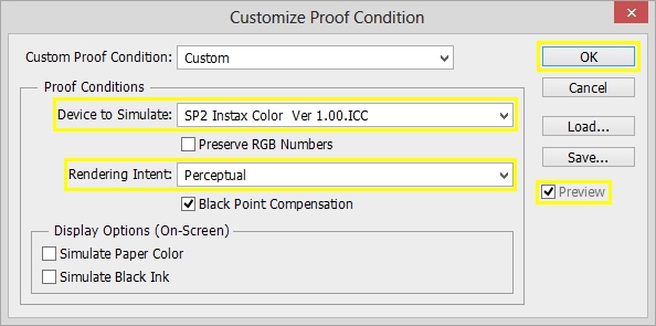
Gamut warnings are turned on by accessing: View > Gamut Warning
In Krita, soft proofing is implemented by accessing: Image > Properties …
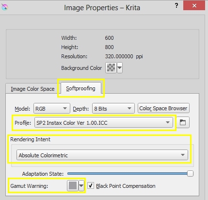
Gamut warnings are turned on by accessing: View > Soft proofing, and View > Out of Gamut Warnings
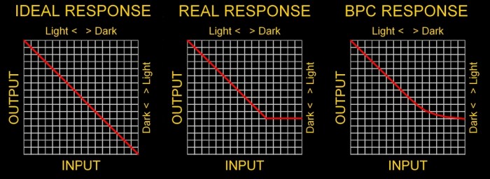
G . 6 Black Point Compensation (BPC)
Black point compensation is a choice given when setting the rendering intent for a colour space / profile conversion. Because output devices, particularly printers, typically cannot achieve a full deep black (absence of any reflected or emitted light), there can be a loss of detail in dark tones, where the device’s dark tone capability has “bottomed out”. BPC helps preserve detail in the very dark tones, by making the dark tone output response non-linear. (Please note that the graphical depiction has been exaggerated in the interest of illustrative clarity).
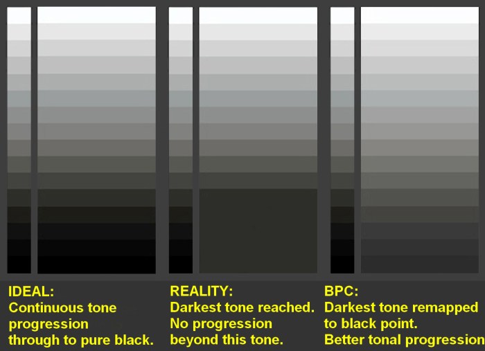
You may wish to consider the relationship between setting the output levels (Section F.2) and BPC, which in some respects, attempts to do the same thing. I am more inclined to use output levels, and not use BPC, partly because there is more user control over output levels, whereas BPC can only be selected as either On or Off. Most photographers select BPC On, for artistic and general photography.
G . 7 Convert (Not Assign)
In order to apply the profile to the Instax file, in Photoshop you must use the Convert function, rather than the Assign function. Assign only tags the file to let software know that it is associated with a particular colour space or profile, but it does not actually change the numbers which specify he colours. Since the image will ultimately be sent to the SP-2 printer via the Share App, and the Share App does not implement a colour management system (so, it doesn’t read tags), the colour profiling must be done and “baked” into the image file, before transfer to the Share App. The Convert function will do this.
G . 8 Summary of Options
At the moment, you have three options for colour managing your SP-2 colour prints, depending on whether you are going from camera-to-print, or from camera-to-computer-to-print, and also on whether you wish to exercise some more control over the rendering of greens and cyans:

On computer, you can preview the image with different colour spaces / profiles, without actually converting it. Also the ability to soft proof can be a very useful tool in choosing the best colour management option. However, because someone viewing the final print generally doesn’t have an alternative version to compare it with, you probably won’t get people criticising your choice of colour strategy, so don’t be overly concerned about the objective perfection of the colour rendition.
Section H – Working in Monochrome
H . 1 Choice of Film Type
Black and white prints can be produced by either using Instax Monochrome film, or by printing monochrome-converted images on Instax colour film. However, compared to the use of colour film for black and white prints, using the Monochrome film has several advantages:
- its tones are more neutral
- it displays a very fine film grain (perceptible under close examination)
- its resolves detail slightly better than the colour film (perceptible under close examination)
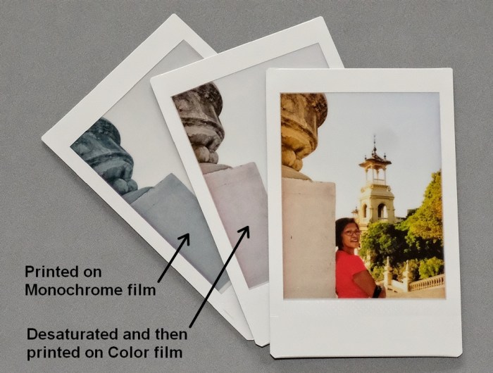
In the comparison below, the black of the colour film (which was produced by developing un-exposed film) is quite warm compared to the Monochrome’s black. Similarly, the white of the colour film is a slightly warm “cream” colour, compared to the more neutral white of the Monochrome film.

Although in very fine regular detail, the Monochrome film is susceptible to moiré patterns , its freedom from colour moiré gives a better and more pleasant rendering of fine repeated detail than the colour film does, and so, effectively delivers higher usable resolution. Note especially that lines on the Monochrome film are almost entirely free from “jaggies” (jagged edges), which can only be detected under very high magnifications.


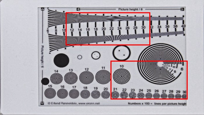
Resolution Test Chart © Erlend Rønnekleiv, http://www.eronn.net Used with permission.


[It should be noted that the production of these moiré and aliasing artifacts, only applies to when film is used in a Share printer, not to when it is used in an Instax camera. This is because, exposure in the printer is digital, using a regular placement of red, blue and green LEDs, which leads to photon clustering around discrete exposure points. In contrast, use in an Instax camera is completely analogue, with photon capture locations being completely random.]
H . 2 Converting to Black & White
To print black & white photos on Instax colour film, the image will first have to be converted to a black & white image. However, even for the Monochrome film, better results are obtained if the image is converted. To get the best results from Instax Monochrome film on the Instax printers, I recommend the following points:
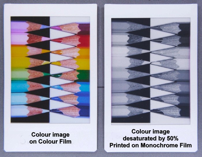
- always perform a monochrome conversion, or at least partially desaturate the image
- if converting by a simple adjustment of a desaturation slider, try desaturating by 50%
The Instax Monochrome film chemistry is susceptible to producing slight colour-cast artifacts when it is subjected to certain intense hues. For instance, strong yellow and green hues can lead to their respective grey-tones taking on a yellow-green cast. (For this reason, I don’t recommend using a yellow or orange lens filter on the camera if shooting images that are destined for Instax Monochrome film). Similarly, strong cyan hues can lead to a slight blue-purple cast in their respective grey-tones.

Depending on the desaturation strategy, full desaturation can sometimes lead to poor tonal differentiation between differently coloured objects. For simple desaturation, a 50% desaturation will both, help avoid colour casts artifacts, and also ensure that subtle tonal differences between soft hues are not lost.
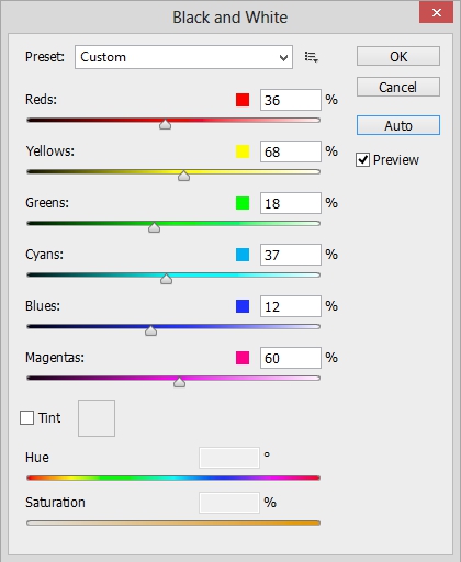
A black-and-white or monochrome conversion is generally preferable to simple desaturation, since the conversions typically offer more control, including control over how individual colours are converted. In Photoshop, I recommend using the Black & White filter. Access the filter via these menus:
Image > Adjustments > Black & White …
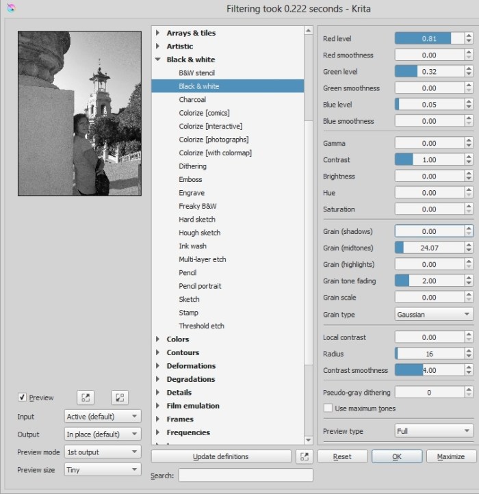
In Krita, I recommend using the G’Mic Black and White filter. Access the filter via these menus:
Filter > G’MIC > Black & White > Black and White
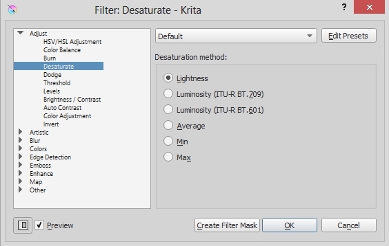
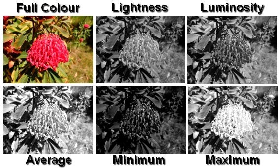
Alternatively, Krita also provides a Desaturate filter, which gives a choice of six different desaturation models. The different strategies deliver very different tonal renderings. The Desaturation filter is accessed via these menus:
Filter > Adjust > Desaturate …
Section I – Acutance
Acutance refers to the subjective perception of detail that is suggested by the edge contrast of features within an image, as opposed to the detail that is a function of resolution. Acutance is typically enhanced by sharpening, which is an increase in contrast along edges. Some advantages of computer pre-processing of images are:
- You can select to sharpen images
- You can select the type of sharpening
- With some types of sharpening, you can make precise adjustments to sharpening parameters
I . 1 Sharpening
Because other operations can affect how sharp an image looks, it is considered best practice to do sharpening as the last operation before saving the image file (typical practice in late binding workflow). This allows for the sharpening to be the most appropriate type and amount for the image’s final size and resolution. Among the sharpening methods are:
- Generic “one-click” sharpening processes
- Un-sharp mask
- De-convolution sharpening
- High pass sharpening
Not all software packages offer all methods. I have found good results from Instax printing with the “one-click” methods, and usually use them, unless the image has particular needs that would warrant use of one of the more controlled (by user) methods.
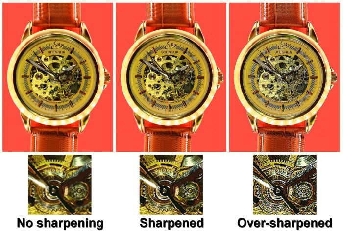
With sharpening methods where the user can adjust the parameters, there is always the possibility of going too far. Over-sharpened images will typically display over-shoot errors and artifacts (“halos”). Good sharpening should have a natural look, and the viewer should ideally be unaware that the image has been sharpened.
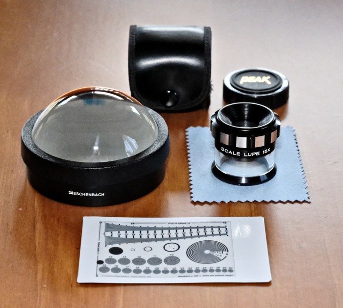
While critics of Instax Mini film claim that the format is too small, specialists who wish to use the film as a media for documenting coins, stamps, and small items of jewellery, will easily recognise the appropriateness of the Mini format, especially for 1:1 scale reproduction. Such specialists are the ones likely to subject the prints to examination with magnifying devices, (and the 320 dpi resolution can bear this magnification). In cases of such minute examination, an appropriate use of sharpening is especially important.
Sharpening won’t help an image that is inherently blurry. The image needs to be captured in sharp focus, and an appropriate work-flow should maintain its resolution potential, until the final sharpening process.
Section J – Output Format
J . 1 Save Format
The final image format must be in either jpg or png file formats. The Share App cannot open Raw files, tif files, or any other image formats. Of course, on computer, you can open any image format, just as long as you save it in a Share App readable format, when you have finished processing it. Jpg is recommended as the normal saving format, in view of its universality – virtually all image handling software can read and save jpg files. However, you may have other reasons for preferring to deal with your Instax intended images as png files.
J . 2 Save As …
When executing the Save operation, you should use “Save As“, which will request a new file-name from you. Using “Save As” will avoid the possibility of accidentally overwriting your original image file, if it happened to be in the same jpg or png file format as the new image file. I recommend including “SP2″ (or SP1 if using the older printer) in the new file name. Then the file name will quickly indicate that:
- the file is Instax print ready
- the file is not suitable for re-purposing
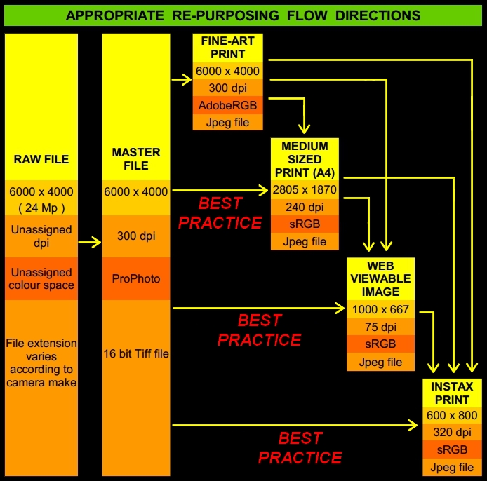
Re-purposing is when you convert an image file for another use. An Instax prepared image file is too specific and limited in its specifications, for it to be useful for re-purposing as anything other than perhaps a thumbnail image. That is why it is especially important to ensure that when saving the Instax image file, we do not overwrite any higher resolution and larger colour space file that it may have been prepared from, because you would lose the re-purposing potential of that file. In general, trying to re-purpose an Instax prepared file, would be a violation of the proper re-purposing work-flow direction, which allows down-stream (from higher to lower specification) re-purposing, but not up-stream (from lower to higher specification).
Section K – Printing
K . 1 Image File Transfer
Even though the image files are now “Instax print ready”, they still have to be opened in the Share App in order to be printed. Transferring image files from the computer to the smartphone or tablet is sometimes a bit trickier to do than the transfer from digital camera to the computer, which is often just a case of inserting the camera’s memory card into the computer’s card reader. Computer to mobile device transfer options depend on what computer operating system (OSX, Windows, or Linux) is combined with iOS or Android on the mobile device, and also each units hardware devices, and even such things as whether an android device allows root access. Options that might be available include:
- Bluetooth
- MicroSD card
- OTG cable
- Cloud
- Wifi local network
Saved as best quality level jpg file, size should be under 1 MB, although it is common for the files to be less than half that size. Saved as highest lossless compression png file, size should be under 3 MB. Even on a slow or limited transfer method, the jpg file sizes should not present a problem. If all else fails, emailing the image files to yourself is an easy and reliable option, even if not as convenient as the others.
K . 2 The Share App
If the image file from the computer has truly been optimized for Instax printing, then in principle it should not need any further processing. For a person to optimize an image on computer, and then run the image through the Share App’s Intelligence filter, would seem to indicate a lack of confidence in their own work. I recommend that in general, no Share App editing be done on an optimized image. However, the Share App is useful for a final pre-print preview, to alert you to not having done something properly, or maybe even having forgotten to do it at all. You should bear in mind that the Share App’s display of your image represents an optimistic, best case scenario. If the preview doesn’t look good, don’t expect that the actual print will look any better. If you are not happy with the preview, go back to the computer, and start again on the file. It may be best to scrap the sub-optimal Instax file, go back to a high specification version of the image, and start the processing all over again. It’s always a pity to “waste” a film, not only in terms of dollar cost, but also due to the possibility of finding yourself totally “out of film”.

Section L – Postscript
This study was concerned with the exploration of key concepts and requirements. Because most of the colour information was based on experiments that I have done, the information may be updated from time to time, as I refine my findings.

CLICK HERE TO RETURN TO TOP OF PAGE
It takes me many days or even weeks to produce an article like this. In order to give you a distraction-free experience, I like to keep the site free of advertising, but it means I get no payment for that hard work. If you would like to support me in continuing to produce high quality articles like this one, please consider donating, even a dollar. Thank you.

_______________________________________________________________
All images © 2013-2017 Dom Varney
 Unless otherwise stated, images on this page are licensed under a
Creative Commons Attribution-NonCommercial-NoDerivatives 4.0 International License.

Thank you for this wonderful article! Cant wait for the part 2. I have the SP-1 Do you think it is worth to get SP-2?
Thanks for the kind words, Ivan. When I bought the SP-2, I kept the old SP-1. It turned out to be a good decision, because I can now keep one unit loaded with colour film, and the other unit loaded with monochrome. As for the question of whether upgrading is worthwhile: the rendering of the SP-2 (colour and tonality) is noticeably better, and the USB rechargeable battery is very much more convenient.
Hi Dom, I bought the SP-2 an just made my first print by using your icc profile. The result is stunning! Thank you for sharing this, I can see lot of saving in file cost! : )
Thanks very much for your article. Really interesting and you have done an incredible job putting all this together.
I received the printer yesterday and today I have printed my first copies directly from my XT2… and I am quite displeased as the copies are really far from what I see on my cameras LCD screen or my apple screen.
They look so washed up…. I would like to find the parameters in camera not having to go to any external program as that would be the best. Hope fuji solves that.
Thanks again for your article.
I’m glad you found the article interesting. I have the X-T2, and it works very well with the Instax Printer, but there is a bit of a learning curve involved. If you shoot Raw files, you can do unlimited jpeg-conversion experiments in-camera, without changing the Raw file. Look at the histograms, and try to find what is needed in push/pull, highlight tone and shadow tone adjustments. Also, there will always be a disconnect between a luminous-screen image, and a reflected-light print, in what you can achieve in light and dark. You don’t have to go external processing, but the in-camera work will be a journey of discovery. Hope you enjoy it.
Thanks Dom; tomorrow I will go on trying to find it t but…. if you find it … please share it. I try to work on jpg and send it directly to the sp2… perhaps I am wrong doing it so… My idea is to produce a direct jpg to send to the sp2 and deliver it to my client in about 5 minutes and without using raw.
But perhaps it is worth using raw and doing some converison in camera????
Thanks again
Quick question as you seem very well versed with the instax printers : I have noticed when I print directly from iphone or XT2 to the SP2 there is for a lack of a better word a green like hazing at the top of image and normally appears on the horizontal of the image. I notice it more when the image is of blue sky or black night as the image starts to appear. I thought maybe it was the film but then tried the film in my instax mini 90 and no issue as the edges of the frame are nice and clean. I even had the SP2 exchanged and the replacement did the same thing. As the chemicals dry it become less noticeable. Have you ever noticed this? It appears I’m the only one that has noticed this as I did lots of searching and nothing came up. I have images of what I’m trying to describe if that would be of help. Thank You for your time and thank you for the great information in this article 🙂
Hi Todd. I know exactly the effect that you are speaking of. It is a faint several millimetre wide strip along each of the two long edges of the image, which has a greenish tinge to it, and does not seem to be developing properly. It was one of the first things I noticed when I first used the SP-2. Prints that I have seen from other SP-2’s also showed this effect, and I suspect all of the SP-2 printers actually do this.
To the best of my understanding (a lot of which is based upon reading Fuji’s Instax patents) it is due to a combination of the cross sectional thickness specifications of the Instax film, combined with the design specifications of the SP-2’s pressure roller (which produces the spreading and distribution of the developing chemicals). The effect seems to be peculiar to the SP-2 (although I have seen similar effects when experimentally developing Instax film “manually”). I have come to consider the behaviour as normal.
As you have already noticed, the effect decreases over time. I pulled out a box of SP-2 prints made several months ago, to check them, and the effect was completely gone on almost all of them, with just a few showing an extremely slight purple tinge (1/2 millimetre) along those edges. You would never notice this unless you were specifically looking for it.
So, while Instax prints are considered fully developed after 10 minutes, this edge developing anomaly can take hours or days (or weeks?) to fully resolve itself. It is a strange quirk, but I have learned to live with it, and I don’t think that it diminishes the longer term quality of the prints. One thing to be aware of – If you use the new Black Frame Instax film, the effect may be even more noticeable during developing, due to contrast with the black frame. But again, after several days, it seems to resolve itself. Thanks for reading my article. I hope this further information is useful to you.
Wow…that’s an explanation and glad I wasn’t the only one that noticed it. I just looked at an image from a few hours ago and and you really have to try to see it now and most people probably don’t even notice it to begin with. I guess I have eagle eyes when it comes to attention to detail. Thank you for the explanation and have a great new year. Todd
I just received my SP-2 and realised that all the pictures printed have this hazy white-greenish light leak on both the long side of the film and after a while, it becomes slightly purple. I read a lot of reviews and mostly all of them have the same problem. Is this the same thing that you have explained above and it is normal ?
Hi Shan. Yes, this seems to be the same effect that I described above, and I consider it normal. But as each print gets older, it gradually disappears, so I don’t worry about it.
Excellent article!
My prints keep coming out upside down when printed directly from the Fuji XT-2, any idea of why that can be?
Hi Jonathan. Thanks for the nice comment. Regarding the upside down prints from the printer: I have the X-T2 camera and the SP-2 printer and I have no print orientation problems. I am assuming that you are referring to images shot in the vertical or portrait orientation, and they print with the wide tab of the frame at the top, instead of at the bottom which we would normally expect. I do know of one thing that will give the upside-down-result: When you review your portrait orientation image on the back of the X-T2, it will display vertically, as a smaller image with wide black bands on either side; if you do a 90 degree image rotate, it will now fill the screen (sideways) but you have a bigger display; that’s where the problem lies – if you have rotated the image (even if only 90 degrees) it will print upside down. If this is the problem, then the solution is not to rotate the image, or rotate it back to its original display before printing. Please let me know if this doesn’t fix the problem, and I will do some more experimentation. I do remember experiencing the same problem previously with the X-T1 and SP-1, a couple of times, and I thought that it was a bug, however it was due to something like what I just explained.
Hey Dom,
Yup, that fixed my problem! I had to turn ON autorotate PB in the screen setting to get it to print correctly. This is a minor inconvenience, having to turn this back and forth to go from shooting to printing, but it seems to work.
Thanks so much for the reply.
-J
Thank you so much for this intensely detailed guide! I just picked up an SP-2 today, and I wanted help getting the most out of it, so this article was exactly what I was looking for and then some!
After a few test prints, I’ve come to appreciate the Instax. I won’t lie, at first I was really quite disappointed in the print quality. But I think a big part of that is based on the incorrect expectations that the Instax branding encourages. From the example images on the packaging right through to the “preview” on the smartphone app before you print, at no point is the customer given an accurate indication of what the final printed image will actually look like.
Which is a real shame, because like I said, given the time to adjust my expectations, I now really dig the lo-fi retro vibe. It’s a pity that many customers’ first taste of this fun format may be disappointment or even confusion.
The whole thing has been a crash-course in the world of printing for me, as even though I’ve been shooting for years now, I’ve never printed my own photos. Even simple things like the ambient light that I’m viewing the images in making such a difference to their appearance… so obvious once I realised what was causing the colour cast, but it had really never been something I had to pay attention to before! (I know we can have our sense of colour balance thrown off by ambient light even when using our monitors, but it seems less extreme to me).
In many ways, I think our latest screens have surpassed the printed image in absolute quality, excepting fine-art prints. But there is definitely a whole other level of beauty to the printed image, with its subtle variation in tones, and just the magic of being able to hold a photo. And of course, the way the eye can relax when looking at reflected light.
Thank you again for putting so much effort into this guide. If you ever find the time to make a part two, I’ll be eager to check it out and continue to learn about this nifty little machine!
Hi Colin. It’s great to hear that the article was useful to you. Yes, we have gotten so used to viewing images on a screen (a luminous image) that it skews our expectations for what will be achieved on a print (a reflected light image). Part two is still in the pipeline, but every time I was close to finishing, there were new developments (technology or software) and I went back to doing revisions, but I hope to have that up soon. Hope you get to love the SP-2 as much as I do.
Hello and congratulations, a very thorough read about the printer!I am having a problem with the sp2 printer. All leds keep bliping without stopping and i am getting the message from all my fuji cameras and phone app that there is no film loaded even though i insert a brand new cartridge. Also, every time i switch on the printer it spits out a film that turns out completely black! Maybe you can help me out? Thanks in advance
Hello Nicholas. My apologies that I have been unable to respond until now. For weeks I did not have internet access. Sorry to hear about the problems that you were having with the SP2. I have not experienced this myself, so I don’t know the cause. Maybe you have the issue fixed by now, but all I could have suggested was to contact Fujifilm service. What I do know is that the SP2 begins a new 10 shot countdown every time the film pack cover is opened and closed. So, if you opened the back to check the film pack, when you close the cover, the SP2 will think that a new film pack has been inserted, and automatically perform a film-feed, to eject the dark-slide that is at the beginning of all film packs. If it was not a new film pack, of course what it would be ejecting is an actual film. When I have had to open the back for some reason, I have done it in a film-change dark bag, and I have re-inserted a dark-slide back into the film-pack before putting it back into the printer. (That re-insertion is a little tricky to do). Please feel free to contact me again if you are still having problems, but I mainly think it is Fujifilm who can help you. Thanks for reading my article.
hi i want to use your SP-2 icc but i got confuse. So in photoshop i just need to convert it with that icc like in G. 7 step? or i have to change color setttings in edit menu in photoshop ? thank you
Hi Frank Junior. All the steps that I have shown in the article are optional. In fact most people don’t pre-process on a computer, so they don’t do any of the steps. You can take control, or you can let the Share App do things automatically. Sometimes we just want pleasing colours, and sometimes we want very accurate colours. For pleasing colours, you can do colour edits in Photoshop if you wish. And if you really want better colour accuracy, you might choose to specify a particular ICC profile. But you don’t have to do either of these; the choice is yours. If you find it a bit confusing, that’s OK, because colour management is very complex and a bit confusing. But as you work with colour, over time, you understanding will grow. So just have fun with the SP-2, and feel free to experiment. Thanks for reading my article.
i have been written an imagemagick script, which does the steps you described, and this is what i got in this first test. https://www.flickr.com/photos/norayr_chilingarian/45533377002/in/dateposted/
so first auto levels, then setting output levels, then applying your sp-2 colour profile.
i wonder if it’s better to apply colour profile before levels and output levels?
i don’t know.
Hi Norayr. That’s an interesting question. For a lot of the workflow processes, the exact order is not critical. But in general, processes that are specific to an output method, tend to be done closer to the end of workflow, meaning, just before output. That makes a good argument for doing output levels at the end of the workflow. However, my feeling is that, most of the time, it won’t matter much, which was done first, output levels (which tend to affect contrast and dynamic range) or profile conversion (which tends to affect colour hue). It will be interesting if you can try both ways, and see if there is any perceptible image quality difference. Thanks for reading the article. Have fun with Instax!
Hi,
thank you so much on posting your detailed work on the SP-2.
Do you have a recommendation for the SP-3 printer (profile etc.)?
Thank you!
~Tom
Hi Tom.
Thanks for reading my guide. I don’t actually have an SP-3 (yet), although I do have the SQ10 camera, which uses the same print mechanism as the SP-3. Colour wise, I think that it behaves about the same as the SP-2, which is what I would have expected. So colour profiles for the SP-2 and SP-3 should be similar, if not the same. Soon (which means, when I have the time) I will re-profile the SP-2 (using a better method), and I will try and profile the printer side of the SQ10 at the same time. It will be interesting to see if there are any differences. Ciao!
Really an incredible article. Just getting into the Fuji system and will probably get an Instax printer as well to satisfy my need for physical output. Thanks so much for sharing your knowledge!
I’m glad you found the article helpful, Joey. Ciao!
this is an absolutely incredible guide! it was such a fun surprise to find out that i was not the only one that saw the power of these prints and the possibilities fuji has presented with speed and mobility here. going through the process of trial / error with the cropping and image sizing was a nightmare, and this guide hits it out of the park. when the prints are this small, the edges are so, so important sometimes and i am so happy to now know how to include every last pixel of each frame! i’ve been using an x-t2 to take mobile portraits while traveling; fuji is the best. THANK YOU!
Thanks for your kind comments, Jeremy. I’m glad you found it useful.
Wow, thank you so much for this detailed guide!!